Making Max 7 look like 6.
What’s this about?
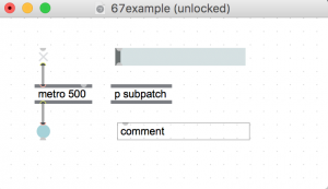
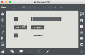
The UI in Max 7 reverses foreground and background from previous versions of Max (and Pd). Additionally, a secondary toolbar menu frames the patcher and all sub-patchers. For example, here is a simple Max 6 patch and its Max 7 equivalent.
Max 6:
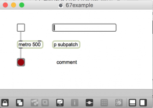
Max 7:
Regardless of which look you find more appealing, the new UI is problematic in several ways.
- Light text on dark background can be difficult (blurry) for people with vision impairment – given the same font size and screen brightness.
- Patches created in previous versions of Max lose their original design.
- Larger objects and toolbar frames consume more screen space.
- If you like to sketch ideas with pencil – an empty white patcher screen is like paper.
Max 7 doesn’t include a black-on-white style, but you can make your own. And lose the toolbar. Here is a new and improved version of the patch:

Making a new style
The process is arcane. But it took less than a half hour to get results. Then I wasted time endlessly tweaking.
The secret recipe came from a 2014 Cycling 74 forum post by Phiol, with assistance from Ben Bracken. Everything you need to know is explained in Phiol’s first 2 posts in the thread. https://cycling74.com/forums/topic/custom-color-scheme-layout-setup-walkthrough/#.V6oHMZMrIcg
I encourage you to read both posts and follow the steps precisely. There are no shortcuts. I will paraphrase Phiol’s method here:
- In a default patcher, make a bunch of objects and then in the Format Palette (object inspector) change them to whatever colors you want
- Select all the objects in the patcher
- In the Format palette, make a new style – this style will be for multiple objects
- Select the patcher to activate it in the Format palette
- In the Style menu (located in the patcher inspector window), select the style you just made, applying it to the patcher level
- Delete all of the objects in the patcher
- Save a new template (in dropdown file menu “create template”) and make it your default.
And then the bad news:
Step 1. is important.
- You must start from a blank “Default Patcher Template” and choose “Default Max7”
- You cannot copy/paste objects that you had already done your custom colors. You will have to start from scratch. one by one.
- In the inspector window, make sure the “Appearance style” has nothing selected in it’s umenu
Then do all the steps mentioned in the previous thread.
The Glitch/bug:
-Gradients objects do not work.
For example, [message and umenu] would not keep my custom colors.
Workaround: Once you have started a new patch, reselect your “custom_style” in patch inspector window or the ‘format’ sub menu. That is, click the style that should already be selected/checked – and now it should work.
So yes, for now, as we start a new patch we will we have to make it a habit to always select our “custom_style” in patcher inspector window or the format sub-menu.
patcher inspector window
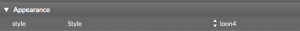
format submenu
(click the paintbucket icon on the top toolbar)
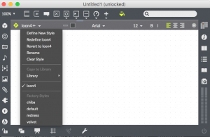
Copy style to library
Also, when you open older Max6 patches and/or the help patch and want to apply your new custom style template, make sure that in the “Format” dropdown menu you have selected the “copy style to library”.
Loading Max 6 patches
Once you’ve done this, you will be able to apply you’re custom style to older/help patchers and resave them with your custom look. To do so, you open Inpector’s Appearance again, and select your “custom_style” that will be in the Library style.
Walking through the process of step one
If you are totally confused at this point, so was I.
Starting with step one above, make a patch with common objects, that looks something like this:
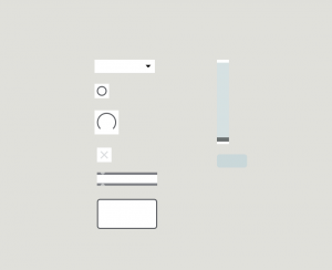
Select each object individually, then with inspector, change the background color to white, or a lighter shade, and the text color to black.
You may need to experiment. Try with a small number of objects at first – because you will probably need to do the whole process several times. As noted above, you have start from the begining each time by hand. You can’t modify a style after you save it.
Then, you should be able to follow the rest of the steps from Phiol’s post.
The objects used for this style are:
- umenu*
- button
- dial
- toggle
- generic object
- textedit
- slider
- message*
*these objects use gradients
Making a white patcher background
- open a blank patcher
- ctrl click on the background and select “Inspector Window”.
- Change the unlocked and locked background colors to white.
- Then, from the File menu, select ‘create template’ and give it the same name as the template you selected in step 7 above (and make sure to check ‘default for new patchers’)
Getting rid of the tool bar frame
The procedure is basically the same as setting the white background.
- In a blankpatcher, open the inspector window and uncheck ‘show toolbar on open’.
- Then, from the File menu, select ‘create template’ and give it the same name as the template you selected in step 7 above (and make sure to check ‘default for new patchers’)
Note: you can toggle the toolbar anytime with <cmd>8
If subpatchers still have the default look
If you create a subpatch and it reverts back to the default style then…
- In a blank patcher, open the inspector window and set the subpatcher template to your new tempate created in step 7 above.
- Then, from the File menu, select ‘create template’ and give it the same name as the template you selected in step 7 above (and make sure to check ‘default for new patchers’)
More about styles and templates in Max 7
Check out the Cycling 74 vignettes about styles and templates to get a better understanding of what’s going on here: